
For over 100 years global sea levels have been measured by tide gauges. Their distribution has of course changed dramatically with time – just like weather stations. Satellite altimetry measurements have only been available since 1992. Therefore we depend on measuring long term sea level rise on the tidal measurements to determine whether or not SLR is increasing as a result of climate change. Sea levels have been rising since the last glacial maximum, rising by over 100m. Of course all climate scientists today also believe that the rate is accelerating due to climate change. But if science is to mean anything then the rates must be derived from independent measurement data based on tidal gauges and Satellite altimetry.
So if we first restrict ourselves to just tidal range data then we get the following result.

Global Sea level rise based on tidal gauges.
So apart from the early period there has been a linear rise in sea surface levels since 1920. Has the trend accelerated though ? We are often told that the rate of increase in SLR has quadrupled – a common meme ! But is this really true ? I downloaded all the satellite altimetry data from NOAA (Topex and Jason 12 & 3) and normalised it to the tidal range instrumentation available here. This is what I get if I take a 12 month average to remove some of the seasonal effects from the radar data.

You would be very hard pushed to see any acceleration in trends based on the available data. Note I am only using the official NOAA altimetry and tidal gauge data. Yet somehow we are expected to believe instead that rates have quadrupled . This claim is mainly based on a paper from 2011 by J.A. Church and N.J. White “Sea-level rise from the late 19th to the early 21st Century” Surveys in Geophysics (2011). Here is what they find updated to 2020. This shows a sudden kink increase in trend in 1993 when the satellite data take over, but this is not seen in the actual data.

Sea level change for 1900-1992, based on tide gauge measurements, from J.A. Church and N.J. White “Sea-level rise from the late 19th to the early 21st Century” Surveys in Geophysics (2011), but multiplied by 0.78 to reduce the 1901-1990 trend to 1.2 mm/yr
So what they did was simply to flatten the tidal data curve by multiplying the slope by a factor 0.78 thereby reducing the 1901-1990 trend to 1.2 mm/yr ! But even that doesn’t completely explain it. I get a rate of 2.9 mm/year SLR base on the Topex/Jason altimetry data, so somehow they have also boosted the satellite rate of change as well to 3.4 mm/yr! They also cut the data off at 1900 which implies a slower rate of increase before 1930 of 0.6 mm/yr. However if instead they had used all the data back to 1870 then that rate would have doubled!
NOAA also get a rate of change of 3.0 ± 0.4 mm/yr using all the available satellite data which agrees with what I find.

So the conclusion is that global sea levels have been rising consistently by 2.5-3.0 mm/year since 1920. Furthermore there has been no significant acceleration in this rate during that time. The often repeated claim that the rate of sea level rise is accelerating and has even quadrupled is not consistent with the data.


A very good, concise report
Great analysis. It is a total furphy to think that satellites have anywhere near the resolution of ground tidal meters. Even the land movement of ground tidal meters is less than the errors in satellite data.
Interestingly the University of Colorado Sea Level Group find that the best fit is not linear, but quadratic and shows acceleratiion of 0.097 +/- 0.025mm/year.
https://sealevel.colorado.edu
Also “interestingly” their fit is only to the years since about 1992.
Did the extra parameter for the quadratic fit significantly iumprove over the linear fit? May we see the Aiokake Information Criteria test?
The NOAA satellite data you’re using is not corrected for GIA, hence a lower trend than the final corrected satellite data shown.
Your discussion of claims about quadrupled rise rates is very confusing. At first you claim that they’re mainly based on Church and White 2011, but then show a graph without linking to the source, which clearly cannot be from Church and White 2011. It does show a version of the Church & White 2011 reconstruction, but with a 0.78 multiplier (not applied by Church and/or White!), as you state. However, bizarrely, you don’t provide here the reason given for that multiplier, which is to match the 1900-1990 rate reported by the Hay et al. 2015 tide gauge reconstruction. Presumably the creator of the graph did this because there isn’t a data file easily available for the Hay et al. reconstruction.
In fact claims about quadrupled rates don’t have anything to do with Church and White 2011. They’re primarily based on more recent, more advanced, reconstructions like Hay et al. 2015 and Dangendorf et al. (2017, 2019). More recent reconstruction methods have tended to find lower overall rise during the 20th Century, a little over 1mm/year.
Thanks for all the detail. I’ll have a look.
Yes: figure 2c of Dangendorf et al. (2019) is illustrative (https://doi.org/10.1038/s41558-019-0531-8). If you want a tide-gauge-only analysis, Houston, who had previously published many papers contrary to the consensus, recently found that the longest records _do_ show acceleration: https://meridian.allenpress.com/jcr/article-abstract/37/2/272/450977/Sea-Level-Acceleration-Analysis-of-the-World-s?redirectedFrom=fulltext. (I prefer the Dangendorf analysis, but I figure some people may be find Houston’s previous publishing record persuasive).
Also, rather than plotting absolute sea level, if you plot a moving 30-year average sea level rate, it becomes much easier to see what’s going on…
Thanks for the Houston paper link, MMM!
Note, though, that 0.0128 ± 0.0064 mm/yr² is a very tiny acceleration. If that amount of acceleration were to persist for a full century, it would increase the rate of sea-level rise by just 1.28 ±0.64 mm/year.
E.g., it would increase the rate at Honolulu or Harlingen from 1.5 mm/yr (6 inches per century) to 2.8 mm/yr (11 inches per century).
It would decrease the rate of sea-level decline and the rate at Stockholm from -3.8 mm/yr (15 inches of sea-level decline) to -2.5 mm/yr (10 inches of decline per century).
Although careful analysis of precise measurements might be able to detect it — barely — nobody else would even notice such a slight change. Even if it achieves statistical significance, it is of no practical significance.
Here’s a photo of a Dutch farmhouse next to a Dutch dike. Try to picture how much eleven inches is, compared to the height of that dike. Does anyone think that Dutch civil engineers would find it challenging to cope with eleven inches of sea-level rise per century?
Of course, the Houston et al. work is acceleration over the full century – if you look at the Dangendorf paper, that includes periods of 0.09 mm/yr/yr acceleration (briefly in 1930, and persistently from 1970 to present) and periods of -0.1 mm/yr/yr deceleration (the 1950s). So presumably if Houston et al. looked at the acceleration in the latter part of their records, they would also find higher values.
From the abstract, it appears that Houston used records with at least 75 years of data, which suggests that it was from about 1945, rather than the full century. But I’ve not found a copy of the paper yet; if you have it, will you please send it to me? My address is:
ncdave4life at that big googly email provider that everyone uses.
One nit: Houston has not written any papers “contrary to the consensus.”
You seem to be of the mistaken impression that there was a consensus that sea-level rise has accelerated in recent years. In fact, the longstanding consensus in the literature is that there’s been little or no sea-level acceleration since the 1920s.
Some climate alarmists mix and match data from different sources, like tide gauges & satellite altimetry, to create the illusion of a large acceleration in the rate of sea-level rise, a sort of “IPCC Sea-Level Nature Trick.” But even the IPCC’s Third Assessment Report (2001) noted the “observational finding of no acceleration in sea level rise during the 20th century.”
In fact, even Church & White 2006, “A 20th Century Acceleration in Global Sea-Level Rise,” admitted that no other papers had detected evidence of 20th century sea-level rise acceleration — and it turns out that the “20th century acceleration” which they found had a confidence interval that went all the way down to zero. Plus (although they didn’t mention it in their paper), that acceleration was entirely prior to 1925.
Here’s another example: Zervas, C. (2009), NOAA Technical Report NOS CO-OPS 053, Sea Level Variations of the United States, 1854 – 2006. It says:
One thing to beware of, Clive, is the assumption that your readers will know what you know. In particular, some readers might not instantly recognize what “acceleration” looks like in a graph. I think you might be surprised at how many “climate journalists” and “science communicators,” and even “climate scientists,” fall into that category!
It is an unfortunate fact that when a person mistakenly thinks he understands something, that tends to quite effectively inoculate him against the risk of ever actually learning about it. The fields of “science journalism,” “climate communication,” “climate science,” etc. provide many examples.
Often people think they know what acceleration looks like in a graph, but they are confused. So I sometimes show people these nine little graphs, and ask them if they can tell me which ones depict (positive) acceleration:
If they don’t know or get it wrong (or if they just change the subject!) I direct their attention to a little primer:
https://sealevel.info/acceleration_primer.html
Another thing to beware of is that, because there is a great deal of variability between the sea-level trends seen at different sites, a “global” sea-level index constructed from a varying selection of individual measurement records can exhibit spurious apparent acceleration or deceleration, depending on which sites are used.
That “Global Mean Sea Level Change” graph, which appears to show an abrupt acceleration in 1993, when the tide gauge trace ends and the satellite altimetry trace begins, is an example of that. (In fact, in that case there is NO overlap between the measurement sites used for the blue and red traces, because tide gauges can only measure sea-level at the coast, and satellite altimetry can only measure the height of the deep ocean, and cannot measure it near the coasts.)
IMO, the best way to avoid that problem is to limit the data you use to sites with the very long measurement records, so that you can use the same set of measurement sites for the entire graph. For instance, this graph is the average of one of the two highest-quality Pacific measurement records (and the other shows even less sea-level rise), and one of the highest quality European measurement records (both with quite typical trends):
https://sealevel.info/avg_of_harlingen_and_honolulu_1905-2018_vs_CO2_annot01.html
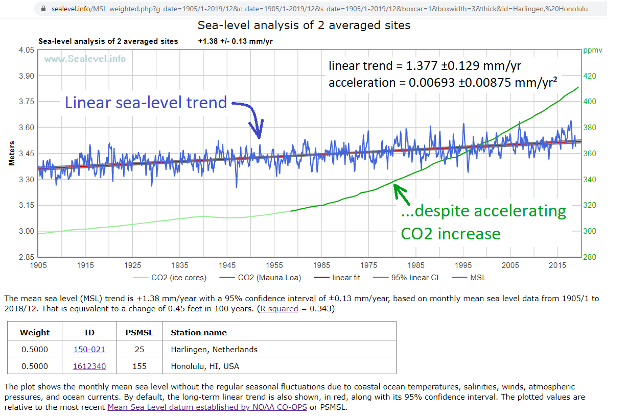
https://sealevel.info/MSL_weighted.php?id=Harlingen,%20Honolulu&boxcar=1&boxwidth=3
My analysis concluded that the global average coastal sea-level trend, from the highest-quality measurement records, is about +1½ mm/year (? 6 inches/century). But that rate is so minuscule that in many cases it is dwarfed by local factors, like vertical land motion, sedimentation, and erosion. Greta Thunberg’s hometown of Stockholm is one of those places:
https://sealevel.info/MSL_graph.php?id=Stockholm
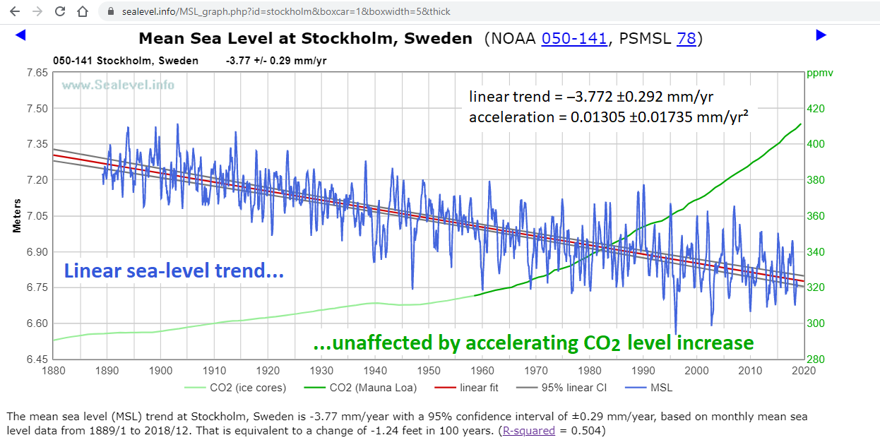
If sea-level rise accelerated, it would help with Stockholm’s dredging expense. Unfortunately for Stockholm, there’s been no significant reduction in the rate of sea-level decline there.
Thanks – You have it exactly right !
Sea level change is still immensely slow compared to a single lifetime. Plate tectonics also has large effects long term effects which are ignored.
What is that depicting? I can see a bit of continental drift (Atlantic broadening, Australia moving north), but what are the white whisps down the middles of the oceans?
Ice ages started ~5 million years ago which I think is most likely due to the rearrangement of the continents. This is all based on this data https://www.earthbyte.org/paleodem-resource-scotese-and-wright-2018/
Here is my post and animation of it.
https://clivebest.com/blog/?p=8574
Neat! So the white wisps down the middles of the oceans are shallow areas?
Yes shallower seas.
I wonder if there is a selection effect for the tidal gauges – the oldest ones tend to be placed in port areas, which naturally enough are habitable sorts of places, usually near to points where rivers meet the sea and where the hinterland is fertile. These areas are going to have certain characteristics and not reflect a random sample of points on coastlines of c150 years ago.
But good point that like measurements should be compared with like.
I agree. Until recently, tide gauges were almost always placed according to the needs of shipping traffic: near harbors and channels. Those places also tend to have cities and be near river outlets. Cities tend to be affected by groundwater extraction (to meet the fresh water needs of urban populations) which causes subsidence.
River outlets tend to be heavily affected by sedimentation. Sediment is carried there by the rivers, which progressively loads the land with additional dirt, and, in the long term, can cause a great deal of subsidence in places like the Mississippi River Delta:
https://sealevel.info/MSL_graph.php?id=grand+isle&g_date=1940/1-2024/12&c_date=1940/1-2024/12&s_date=1940/1-2024/12
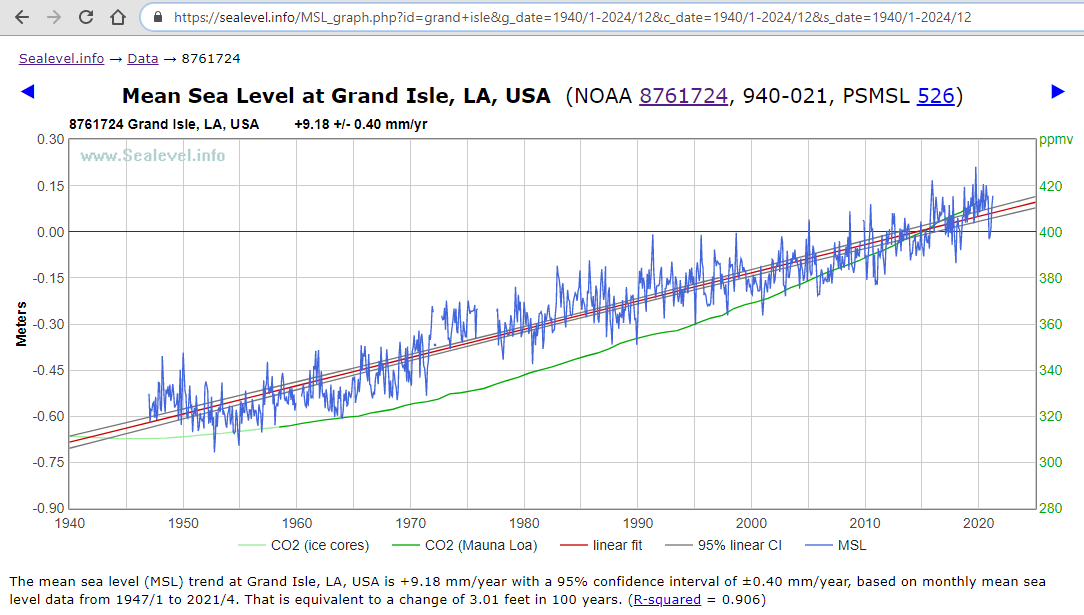
Subsidence due to groundwater extraction and long term sedimentation at river outlets are both factors which tend to increase local (“relative”) sea-level trends. Yet, in practice, it is the newest tide gauges which often seem to show the greatest sea-level rise. I don’t know why.
Maybe sites with flooding problems are thought to be more “interesting.” Maybe people install tide gauges in those places to try to figure out why they’re getting so many floods, and/or to help them predict whether the floods will worsening. Thus we tend to get new tide gauges installed in the places where there’s the most subsidence, because those sites have the most subsidence. But that’s just a guess.
Tamino has some interesting posts on sea level data.
https://tamino.wordpress.com/2018/05/24/sea-level-data-church-white-or-jevrejeva-et-al/
https://tamino.wordpress.com/2018/02/04/huge-problem-with-jevrejeva-et-al-sea-level-data/
https://tamino.wordpress.com/2019/10/05/sea-level-rise-2/
https://tamino.wordpress.com/2019/10/21/sea-level-acceleration-since-the-1960s/
Some of the best non-literature work & explanations I’ve seen on sea level and it makes a convincing argument that the newer Dangendorf dataset is more accurate than older ones, especially those based on the “virtual station” method.
Beware of disinformation from Tamino (Grant Foster). His blog is very heavily censored to suppress dissent, and especially to prevent correction of his own errors.
I write from personal experience. Here is my discussion of some examples:
https://wattsupwiththat.wpcomstaging.com/2013/04/01/mcintyre-charges-grant-foster-aka-tamino-with-plagiarism-in-a-dot-earth-discussion/#comment-1263363
Tamino even censors responses from targets of his own attacks. E.g., he let me post ONE comment on an article he wrote criticizing my work, and he then deleted ALL my subsequent comments, leaving no indication that I’d ever posted them.
He does that sort of thing to keep his errors from being corrected, some of which are egregious. E.g., here’s my illustration of how he cherry-picked a starting point, to exaggerate a trend, and create the illusion of sea-level rise acceleration:
Here’s Tamino’s version:
Really, unless you like be misled, I suggest that you avoid Tamino’s blog. Here are some better choices:
https://sealevel.info/learnmore.html#blogs
Just had a look at Tamino’s blog again. It seems to have morphed into an anti-Trump/Covid diatribe. His link to “Sea Level Rise” is also broken.
https://sealevel.colorado.edu/results.php
Yeah, luckily it’s easy to ignore those. The posts I linked are all Trump-free.
The first difference issues are compelling, I did Monte Carlo tests for some other satellite comparisons and Tamino’s point was spot on. The virtual station parts seem credible too, but I haven’t checked those myself.
It seems sensible that (1) we shouldn’t use records based on Jevrejeva methods to quantify details of long-term global sea level rise and (2) more recent reviewed work has come out with methods that address those issues.
So I’m pretty convinced that if you want to investigate pre-satellite sea level rise, you should use the Dangendorf data. I’ve asked sea level experts who told me the same, but I’d be fascinated to see more evidence and keep learning.
Tamino has produced a lot of excellent, reliable, educational and accurate statistical work on his blog. I’ve checked a bunch of his results myself and they stacked up, which earns trust.
I get that you dislike his moderation policy, but I won’t reject well-argued and well-evidenced statistical points from a source who has repeatedly done good statistics.
Looks like his discussion of the Battery often included the full record, too.
https://tamino.wordpress.com/2012/09/28/sea-level-rise-along-the-atlantic-coast-of-north-america-north-of-cape-hatteras/
https://tamino.wordpress.com/2016/05/31/not-even-wrong/
And it looks like that shorter figure is done for comparison with a full record trend raised elsewhere.
https://tamino.wordpress.com/2019/03/06/sea-level-rise-sea-level-lies/
The #1 reason Tamino/Foster censors his blog is to prevent correction of his own errors.
The NYC tide gauge at Battery Park, a/k/a “The Battery,” at the southern tip of Manhattan, is either on or immediately adjacent to an extension of the island which was created by filling in part of New York Harbor.
The fill dirt is presumably settling, which is probably why it records more rapid sea-level rise than than other sites in the region. Places which been built on fill dirt tend to sink, for many years (Galveston is a more dramatic example).
The other main NYC tide gauge is at Kings Point, which is on the north shore of Long Island:
http://sealevel.info/MSL_graph.php?id=8516945&c_date=1931/1-2021/4
Kings Point has 89¾ years of measurements, from 8/1931 to 4/2021. It has recorded a linear trend of 2.314 ±0.196 mm/yr, and an acceleration of -0.00436 ±0.01691 mm/yr² (which is not significantly different from zero).
Here’re The Battery’s measurements, for the same period:
https://sealevel.info/MSL_graph.php?id=8518750&c_date=1931/1-2021/4
The Battery, for the same period, has a linear trend of 3.136 ±0.189 mm/yr, and an acceleration of 0.01770 ±0.01615 mm/yr², which is about 35% more rapid than Kings Point, even though the two sites are less than 20 miles apart. The difference between the trends at the two sites is presumably due to subsidence at Battery Park.
Here’s an average of the two sites:
https://sealevel.info/MSL_weighted.php?id=8516945,8518750&g_date=1930/1-2024/12&c_date=1930/1-2024/12&s_date=1930/1-2024/12

The linear trend is 2.725 ±0.188 mm/yr, and the acceleration is 0.00678 ±0.01625 mm/yr² (which is not significantly different from zero).
Just like most other long, high-quality measurement sites, the NYC measurement sites show no significant acceleration in the sea-level trend in the last 90 years.
Look : https://tamino.wordpress.com/2019/12/10/a-century-and-more-of-sea-level-acceleration/
Why not use the title gauge measurements and adjust them with satellite data for altitude changes and rising or falling land. If a consistent series can be ascertained. Then you can work your way back and adjust prior title gauge measurements for land rising or falling, then a cross sectional geospatial adjustment could be applied for weighting the individual title gauge observations. The title gauge series goes back longer thus tweaking it for individual stations rising or falling and then the geospatial normalization would make it a more accurate measure.